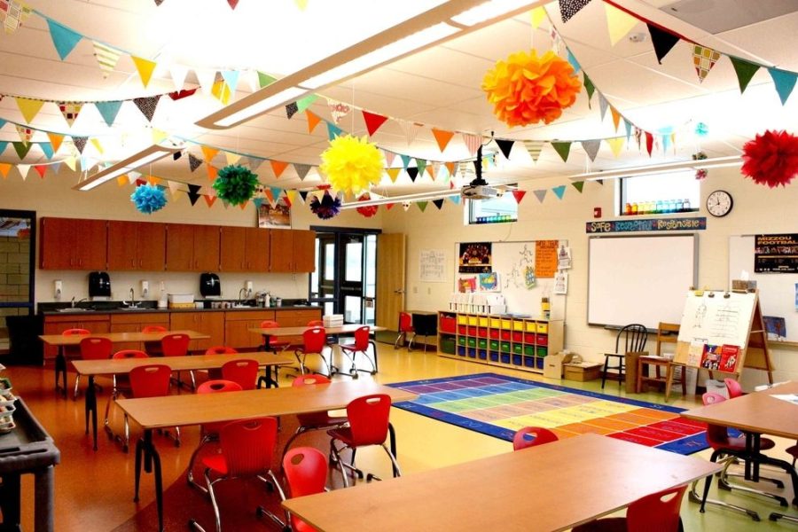
The Spaces We Fill: Classrooms and Setting Educational Tone
January 20, 2023
Every single school day, well over 3000 students at Danbury High School sit in the same desks, in the same classrooms, in the same buildings. Our environments become vague background noise in our daily lives, and we forget to process many of the little details that surround us. The grout between the tiles. The writing on bathroom stalls. The forgotten pencils lying in hallway corners. The suffocating, writhing traffic of shuffling students between classes.
At this point, all of it is mundane. It’s just a part of the DHS experience, and we pay no mind to the physical space we take up every day. Still, when we walk into a teacher’s classroom to find the lights set low and the walls adorned with art, we are reminded of what a change in environment can do for our attention and wellbeing.
When a student enters a classroom, the physical appearance sets the tone for the time they spend inside it. With the vast variety of teachers at DHS, there comes a vast variety of classroom layouts. Some keep the walls bare, some have several fans around, and some have their desks arranged in a circle. Every one of these decisions can change a student’s outlook on the class, the teacher, and learning in general.
When asked, students said that the qualities of a “welcoming” classroom are: decorated, dimly or naturally lit, and having some indicator of being a “safe space.” They are homely and gentle, a direct contrast to the harsh fluorescent lights in nearly every classroom at DHS. To make a classroom feel this welcoming is an effort—you must hang up each decoration manually, keep the lights intentionally down, and leave your door open to whoever needs it.
Just as one’s bedroom is often a reflection of their inner self, a teacher’s classroom is a reflection of who they are, and how they want to appear to their students. If a classroom is inviting or pleasant to a student, they immediately are more likely to trust and engage with their teacher. This phenomenon has been studied by institutions like the University of Salford and Carnegie Mellon University.
Interestingly, Salford finds that factors such as light, color, temperature, and air quality of a classroom caused a variation in educational progress of 16%. Tasks on computers were done faster and with more accuracy in classrooms with better air quality, and closer proximity to plants. Lower levels of eye fatigue and higher levels of attention were observed in colorful classrooms, as opposed to sparse ones. Certain colors are commonly associated with emotions, and this can be used to one’s advantage when decorating a classroom. For example, bright yellow is commonly associated with happiness.
On the other hand, Carnegie Mellon finds that high frequency and complexity of decorations had a negative effect on learning. Accuracy on test questions was higher in a sparsely-decorated classroom (55% correct) than in the heavily-decorated classroom (42% correct). Additionally, 10.2% more students were on-task in sparsely-decorated classrooms.
Thus, a balance must be found. Classroom decor cannot take away from the content of the class, but should instead promote a healthy learning environment. Examples include posters defining literary devices or simple green houseplants. The actual organization of the classroom is very important, as well.
In the University of Salford’s study, a few guidelines for teachers and designers were outlined within the findings. These include: 20-50% of the wall should be visible/undecorated; balance must be created in terms of color—if the background of a room is bright, accents/decor should be muted in color, and vice versa; older students prefer simpler layouts (fewer separate learning “zones”; and windows should generally be unblocked so natural light can enter the space. Sound absorbance also had a positive effect—in other words, use of chair leg buffers and the like.
It is important to note that teachers almost always fund their classrooms entirely out of their own pockets. On average, American teachers spend up to $1000 a year on classroom supplies and decor. Unfortunately, many of the listed accommodations are simply out of the budget for teachers. This puts more strain on teachers and schools, as their funding can only stretch to the bare minimum, rather than being able to make their students feel comfortable and happy at school. Students are left bored and in discomfort, while teachers struggle to fill each pupil’s needs with the limited resources available.
The physical environment of schools and classrooms is often overlooked, worsening the mental health of both students and faculty. More attention put to this issue—namely, more funding for classrooms and intel on design—would all-around improve wellbeing, attention, and attitude of school populations.
Overall, care put into a classroom’s appearance tells students that their educators are attentive, and don’t want the room to feel like every other manufactured classroom. In an instant, the tone is set that this isn’t just a room. It is the home of a student body, and it prides itself on such a thing. Still, it cannot be forgotten that classrooms are meant to stimulate thought. When formatting classrooms, teachers and designers should look to relate the outward appearance of their rooms to the class material while making the room feel less like an institution and more of a workshop.
At DHS today, many classrooms are left feeling barren and dry. It ends up being a struggle for students to come to school at seven a.m. to bright-white lights and screeching chairs. If every classroom had the attention and resources it deserves, Danbury High can ensure that it would become a happier, healthier place to learn.


