DHS replacing Mad Hatter with a new look
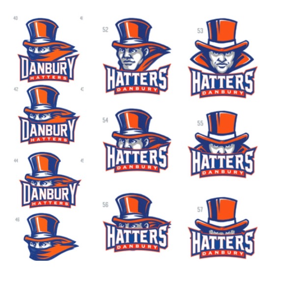
One of these renderings may be the next mascot and logo for the Hatters. Administration is polling faculty and students about the choices. Principal Dan Donovan says he hopes the new mascot will be chosen by Thanksgiving.
October 27, 2017
The school has contracted with a branding company to create a new look for the DHS Hatter mascot and logo, and is polling staff and students on choices.
The branding company, Impact Sports, has made an agreement to design this year’s yearbook cover and provide unisex caps and gowns for the class of 2018’s graduation. The contract specifies the way administration will facilitate the new logos, having a specific design in mind.
After years of each team choosing its own look — with different shades of orange and blue, and adopting varying Mad Hatter looks — Principal Dan Donovan decided it was time for a fresh and consistent symbol for the school.
“We put a lot of thought into giving the school one modern-looking mascot that everyone can use,” Donovan explained. “If you’re on the chess team, football team, track team, etc. you can now use the same logo … as much as the teams [have already been] adopting a Hatters logo, they’re all different. It doesn’t accurately represent the school, that’s [the point] of having a new mascot.”
Any student here knows that some teams have sweatshirts that are off-blue or redder than orange. The contract with Impact Sports means the logo, colors, and fit will be universal for every team. From this point onward, the school has an agreement to use specific colors and fonts on DHS apparel.
“We want students wearing the apparel out in the mall, or at the movie theatre, and we want other kids to see how big our community is,” Donovan said. This means the “Mad Hatter” look, which kind of resembles a Disney version, will be a thing of the past. The new logo will be a variation of the head of a young male, wearing a top hat, and giving a fierce look.
Jamie Mayfield, freshman, said she “thought the school [hallways] would have more color,” and Donovan agreed. The new mascot and new logos for the school will soon be plastered on many of the white sections of the hallways, according to the current plan. “I envision a Fathead in the cafeteria,” Donovan said, laughing. “I want the hallways to be decorated with this fresh, bold, consistent look.”
While Donovan is excited about the branding, he is also having to respond to students who are wondering about priorities. Some are unsatisfied with the conditions inside the school. “The bathrooms are disgusting, some of the doors don’t close and the sinks barely work. The mirrors are scratched beyond repair and most of the time, they smell really disgusting,” said Milbia Lopez, senior. “I don’t even go in there anymore because it makes me feel gross.”
So the question Lopez and others have is why we are spending money on the logo when other parts of the school need work. But Donovan wants them to know this was a free process. The company will make its money on online stores that sell the products.
Donovan said the school will not discard merchandise in stock, and will only restock with the new logos when the current inventory runs low. The cost of the new banners — to be posted in the parking lots — and the planned mural are things that the school already has allocated into the budget.
Students have varying opinions about the new logos, which have been presented to students in Advisory to vote on. Jason Lopez, sophomore, said, “I don’t think that our old mascot was cool at all. It was a cartoon on steroids. But now we are getting new logos with [menacing] faces. I think it will be good for football games and wrestling matches. It shows we are tough.”
A final poll was taken this week with narrowed down options. “There are over 3,000 students in the school, and only just over 1,000 people voted,” in the last survey, Donovan said. “We need more kids to participate in the [polling process] so we have a more accurate depiction of what the student body wants.”

