Aidan Garvey ranks the NHL’s new “Retro” sweaters
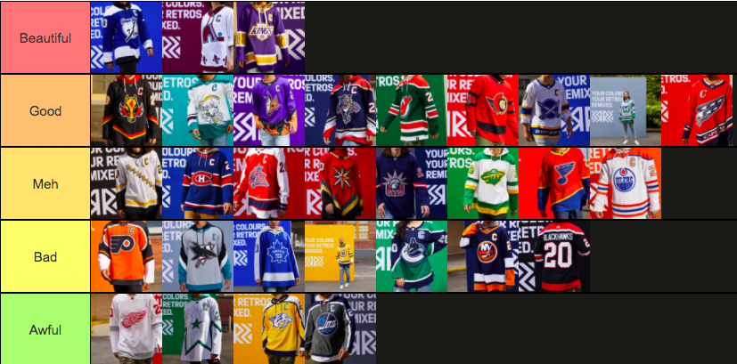
A Complete Tier List created on Tiermaker.com
December 3, 2020
The National Hockey League, recently released a line of alternate sweaters, in which each team embodied their unique pasts. All 31 NHL teams created a jersey which embodied their retro logos, color schemes, and former team names.
Some of the sweaters’ outcomes came out fantastic, some not so great. So in this article I will be ranking all 31 NHL Reverse Retro sweaters.
FULL FAILURES:
31: Detroit Redwings
The effort inserted into the creation of the Detroit Red Wings sweaters were nothing short of abysmal. Fans across North America have compared it to a practice jersey, and frankly I couldn’t agree more. There is very little color range, with white covering most of the jersey and light grey stripes around the elbows. The logo is the same one they have used since 1949. For a team that has existed since 1926, the extensive options of the previous logos seemed to be cast to the side. Overall the jersey is a complete abomination of the entire Reverse Retro project. The color scheme, along with creativity, is lacking, and that is why it is ranked last.
30: Dallas Stars
The Dallas Stars jersey is considerably similar to the Detroit jersey. A main white color surrounds the entire jersey, but the first difference comes with the green and black star that circles the entire jersey. This addition adds some creativity points that place it above last place, but not by much. It should be noted that the Stars did include their logo that they have used from 1996-2008, but they failed to provide the gold outline that would have made the logo pop much more. However, they used a silver color which blends the logo into the white background. For the previous reasons stated above, the jersey places itself slightly above Detroit, at number 30.
29: Nashville Predators
The Nashville Predators Had SO MUCH potential for this retro jersey, and dropped the ball in multiple categories. They used their inauguration logo which they used from 1998-2010; however, they did not carry over the theme in terms of jersey color. The dark navy blue would have worked as a much more suitable option than the bright yellow that can look quite good in moderation, however the jersey looks as if it was coated in mustard. The jersey is just not aesthetically pleasing, and lacks the WOW factor that should have been there from the start. These reasons place this underwhelming jersey at number 29.
28: Winnipeg Jets
The Jets have one of the most nomadic histories in the NHL. They started originally in Winnipeg for the 1979 season, and they remained there until 1996. This move left the Province of Manitoba without a team until the Atlanta Thrashers moved to Winnipeg after a collapsed market in 2011, and the team took the Jet name and didn’t miss a beat in terms of fans. This chaotic history left extensive options for the retro jersey, but Winnipeg came out with something that missed the target by a sizable amount. The charcoal grey infused jersey was not a hit with many hockey fans; the jersey is entirely too dark with a navy and baby blue version of the original logo from the 70’s. They differed from the route that is the Atlanta Thrashers. The Thrashers were not a league favorite in the slightest; however, it would have been a nice homage to their old home down south. Due to extensive reasons, mostly the jersey lacking the color scheme that fans longed for, this way too dark jersey will not go any higher than number 28.
DISASTROUS DISAPPOINTMENTS:
- PHILADELPHIA FLYERS
An entire mental lapse just breeches the tip of the mistakes the Flyer’s design team made on this sweater. Granted, the Flyers joined the NHL in 1967, and haven’t changed their logo besides some minuscule tweaks. However, the jersey just does not look good. It appears like the design team could not decide upon a stealth black or the classic burnt orange look and just decide to go half and half. The burnt orange color surrounds the torso area, while the black extends from the neck down the arms to the forearm, and it does not look good in the slightest. The logo does stick out, which is what puts it above the full failures category and lands it at number 27.
- SAN JOSE SHARKS
The San Jose Sharks did not absolutely obliterate this assignment, they brought back the old shark logo which they used from 1991-2007, when they switched to a more aqua colored shark. The inauguration logo was a nice touch, but aside from that, the jersey did not come close to its potential. They could have gone with a stealth black look, or embraced the aqua color they adopted in 07’. However, they decided to go grey, which was the worst possible mistake they could have made. The Black and blue sleeves don’t help the jersey in any possible way either, overall it just flopped in all areas.
25: BOSTON BRUINS
The Boston Bruins retro jersey reminds me of a bottle of yellow mustard. The yellow is way too bright, and there is way too much of it. The Bruins resorted to their long term logo from 1949-1995. This logo was not a bad choice, but it is too similar to the one they have now. I would have loved to see a return of the bear logo that is often featured on their shoulders. Nonetheless, this poor color scheme and logo will buffer any way of this jersey getting past number 25.
- TORONTO MAPLE LEAFS
The Toronto Maple Leafs did not have the worst idea behind their retro jersey, but just simply failed in the execution stage. The classic maple leaf blue embodies their history since 1928, as the club was previously known as “The Arenas” and “The St. Pats.” They chose the 1967-1970 logo, which was not the best choice, but not a horrific one either; however, the jersey fails in that they used grey instead of white. The Maple Leafs own the blue and white look; however, they strayed from that classic look for some obscure reason that I am not able to pinpoint. If they had kept the blue/white look this jersey would have ended up much higher on the list.
23: VANCOUVER CANUCKS
The Canucks’ jersey is not bad by any means, but there are a few categories that it lacks in. The logo is eerily similar to their current logo, which is the only one without the “Vancouver” over the top of it. I would have much rather seen the “Flying V,” which they wore from 1978-1985, or the “Flying Skate” which they wore from 1985-1997. Not to mention the gradient color scheme from blue to green makes the jersey look like an old school Sprite can. The colors used are not horrible, but I would have much rather seen the black, red, and yellow that they rocked in the 80’s and 90’s. Nonetheless, it is a jersey that while not horrific, is not great either, which lands it at number 23.
22: NEW YORK ISLANDERS
The Islanders’ design team seemed to have procrastinated the assignment and just submitted an old project instead. The Islanders had ONE job to make a successful retro jersey… BRING BACK THE FISHERMAN!! The team embraced their long island heritage from 1995-1997 by using their fan favorite “Fisherman logo.” When the reverse retro jersey was announced, that was the jersey fans wanted to see make a return to the ice for the 2020-2021 season. However, the Islanders simply took their logo that they have used for the majority of their NHL tenure, and make the blue into a navy blue. This complete lack of effort would have put them lower on this list; however, the jersey does not look entirely bad, so they will just fall in the disastrous disappointment category, at number 22.
CLASSIC COMBOS:
21: CHICAGO BLACKHAWKS
Another team with a lengthy history in the NHL: the Chicago Blackhawks. They have had multiple jersey changes since their inauguration in 1926. For their retro jersey, they combined the black color scheme from 1998, and the logo from 1992. While this jersey does look good, it does not pose the “wow” factor or “pop” that sweaters in this category should possess. I would have personally loved to see a cream white look like their 1958 jersey. However, this jersey is a solid addition to the catalog, it does not provide any characteristics to push it past spot number 21.
20: PITTSBURGH PENGUINS
The Pittsburgh Penguins had a lot of ideas to sort through in this particular design process. With many different color schemes and logos to choose from, Pittsburgh’s design team produced a jersey that while nice looking, was not what I personally wanted to see. The jersey that was created is a throwback to 1992. The diagonal lettering of Pittsburgh down the jersey avoids the common penguin logo, which came as a surprise to me. Although the jersey was not in any way bad, I feel like they missed on a couple key components that could have skyrocketed this jersey into the top 10. Personally, I would have loved to see a return of the logo introduced in 1995. I also would have enjoyed seeing the baby blue color to make a comeback. The color hasn’t made an appearance since the 70’s, minus a single game appearance in the 2008 Winter Classic. The combination of these two sweaters would have made a much bigger statement in the reverse retro event. The jersey that was released is solid but not enough to put it above number 20.
19: MONTREAL CANADIENS
The National Hockey League has existed since 1917, and the Canadiens have been there from even before. In their entire stay with the NHL, red has been their main color and blue always stood as a subsidiary. When Montreal revealed their reverse retro jersey, I was shocked to see a mainly blue addition to their traditionally red catalog. The jersey maintains its traditional look, but just swaps the blue and red colors. This color switch did not land very fondly with me, which is why it will reside in spot number 19.
18: COLUMBUS BLUE JACKETS
The Columbus Blue Jackets jersey, while unique, was a tad bit too chaotic for my liking. The logo they chose is not my favorite as it has too much going on at one time. The color scheme that they chose I am a big fan of, but the logo is what puts me off on this jersey. I would have much rather seen the cannon logo they currently wear on their alternate jersey or even “the bug.” This jersey was well done by Columbus but the logo simply did not work for me, which is why I will place it at number 18.
17: VEGAS GOLDEN KNIGHTS
Vegas’ sweaters, while not spectacular, give it enough flare to place it within the top 20. The red themed jersey provides a changeup to Vegas’ traditionally gold and black look. Vegas was at an extreme disadvantage in this retro theme, as their inaugural season took place just a couple of years ago in 2017. Vegas featured their alternate logo, which did not work for some fans. I personally would have liked to see an altered version of their main logo, but the logo they included is not horrible either. In total Vegas did a great job considering their situation, which is why I graded this jersey on a curve, landing them at spot 17.
16: NEW YORK RANGERS
The Rangers chose a recent jersey out of their near 100 year arsenal. The “Lady Liberty” jersey, famously known as the jersey worn by Marek Malik during his jaw dropping shootout goal in 2005. The jersey features a Navy blue background accented by a silver and red lady liberty head as the front logo. As a lifelong Rangers fan, I have to say this jersey was not all that I expected it to be. I much prefer the Winter Classic and Stadium Series sweaters that they have released in the past 8 years, and would have much rather seen a return of one of those. The jersey is plain, and while it is a fond throwback for most fans, it simply didn’t sit well with me, which places it at number 16.
15: MINNESOTA WILD
While some teams went for a full throwback to their origin team, Minnesota decided to go the route of half. The Wild took their current logo, and plopped it into a jersey with the Minnesota North Stars color scheme. The North Stars were active in Minnesota from 1966 to 1993, before moving to their new home in Dallas. Minnesota was only without a team for 8 years however, as the wild took their place for their inaugural season in 2001. The wild pay homage to their minnesotan brother, with an adopted color scheme. This jersey would have placed itself higher with a touch more creativity, however the combination of two franchises puts this sweater at number 15.
14: ST. LOUIS BLUES
This St. Louis Jersey is a solid addition to its lengthy repertoire. The return of the jersey they wore in the 90’s was a great choice to base the jersey off of, but in order to perfect this sweater, the color needed to change, possibly including the blue that they wear now, or even reintroducing the lighter shade they wore in the 60’s and 70’s. This jersey almost has what it takes to land itself inside the top ten, but lacks certain elements which will stick it in spot number 14.
BOLD BEAUTIES
13: EDMONTON OILERS
Edmonton perfected the saying, less is more. The plain white with minimalistic orange and blue accents, fits even for me. This is coming from the guy who has been preaching “DETAIL!!!” for the past 18 sweaters. However, the simplistic approach by the Edmonton design team could not have been more spot on. The jersey looks very similar to that worn by Gretzky in the 1980’s, with a couple of slight color switches that the average eye would not even notice. This jersey absolutely nailed this design, which will start of the Bold Beauties category, at spot number 13.
12: CALGARY FLAMES
Calgary completed a hail mary on this jersey design. The flaming horse logo, that was only briefly used as a main logo, was certainly not the logo expected to make an appearance. The “Flaming A” logo, used from 1972 to 1980 while they resided in Atlanta, seemed to me as a much more suitable option. However the reveal of the modernized stealth black horse jersey served as a positive surprise to me. The color scheme works to perfection and perfectly surrounds the logo, placing it at number 12.
11: ANAHEIM DUCKS
The Anaheim Ducks’ retro jersey was a no brain option, Wild Wing had to make an appearance in his original colors. The team, originally called the Mighty Ducks of Anaheim, which alluded to The Mighty Ducks film franchise, as the organization was owned by Disney. This team existed from 1993 to 2006, and rocked the colors of “jade and eggplant” (teal and purple). They brought back this color scheme 15 years later for the 2021 season, with an animated touch. The jersey is difficult to explain through text, however it essentially entails a full bodied Wild Wing launching out of a sea of iceberg covered water. This cartoon jersey looks unlike any jersey ever seen before in the NHL. however while untraditional, this jersey looks spectacular, it is by far the most creative jersey, and it would be a top 5 jersey if the jersey was not so ridiculously chaotic. The originality is what gives the jersey a much deserved spot at number 11.
10: ARIZONA COYOTES
Another highly detailed jersey belongs to the Arizona Coyotes. The Coyotes, previously known as the Winnipeg Jets, opted out of their Canadian heritage, and decided to focus their retro jersey around their desert surroundings. Arizona featured the base idea from their 1999 jersey and changed the green background to a matching purple of the moon in the full bodied logo. The logo featured only contains the head of the coyote, but does the job just fine. The purple jersey is something very uncommon in the NHL, as it is not often seen in the hockey world, the uncommon color however, works perfectly with the originality of this jersey, and influences the jersey into the top ten at number 10.
9: FLORIDA PANTHERS
The Florida Panthers paid homage to their inauguration logo, which was only slightly altered from 1993 to 2016. They brought the Navy color scheme used from 2003 to 2011, to create somewhat of a “best of the best” combination. The jersey perfectly celebrates the Reverse Retro concept, giving Florida fans a distraction from their zero Stanley Cup wins. The “best of the best” concept lands this jersey deservedly at number 9.
8: NEW JERSEY DEVILS
The Devils must have ironically heard my prayers, and went with the red and green color scheme that I love so much. NHL fans saw a brief glimpse of this green color in the 2014 Stadium Series against the Rangers, but that was the one appearance since it went extinct in 1992. This time however, green takes over the role as the main color, and it works tremendously. I am heavily pleased with the outcome of this jersey, the color work terrifically and as a result, the jersey takes its rightful spot at number 8.
7: OTTAWA SENATORS
The Ottawa Senators had very little room to maneuver in the “retro” concept. They have had the same color scheme for their whole existence, and they could have chosen from 3 logos. The logo they went with is the one they used from 1992 to 2007. This logo is basic but does its job very well. The jersey all together looks great. Ottawa uses the stealth black they used for away sweaters in the 90’s, and it is a great use of color. I have zero complaints about this jersey, but it lacks a wow factor to propel it into the top 5. So for now it will sit placid at number 7.
6: BUFFALO SABRES
These Buffalo sweaters take after the Minnesota Wild concept of combining two eras of sweaters. The Sabres design team simply took their 2000-2006 alternate jersey and slapped their modern day colors onto it. Although the thought process is very thin, it is all they needed to do in order to make an absolutely stunning jersey. The blue and yellow perfectly compliment the white background, and the logo looks great in its new colors. A terrific jersey that is regarded as top tier among fans, lands at number 6.
5: CAROLINA HURRICANES
As a Connecticut resident of 14 years, I have longed for the days of the Hartford Whalers. Hartford, now home to the Wolfpack (NYR AHL affiliate), housed the Whalers from 1979 to 1997. However the team moved to North Carolina and left Connecticut in the dust. Carolina paid homage to their past self however, with a near perfect rendition of the original jersey, with a slight shift from white to light grey. This change while not amazing, does not draw any credit away from the result of the jersey. This jersey looks fantastic, and myself among many other Connecticuters, are heavily pleased with the outcome. This jersey is definitely in my online cart, and it finishes inside the top 5, at number 5.
4: WASHINGTON CAPITALS
Washington adds to the “best of both worlds” trend, combining their 1995-2007 jersey format, with the color scheme used from 1974-1995, and 2007 to present day. The jersey worn at the beginning of Alex Ovechkin’s career makes its debut in red, and it could not lot better. The bridge between two eras blends seamlessly, with a result that lands this sweater with the best of the best. This jersey took flight and finished at spot number 4.
ASTRONOMICALLY AMAZING:
3: TAMPA BAY LIGHTNING
Fantastic does not even touch the tip of this iceberg. Tampa Bay’s design team simply outdid themselves with this sweater. The 1992-2007 logo combined with the classic blue jersey with white shoulders, ensures that the defending champs will be playing this upcoming season in style. Nothing bad can be said about this jersey; however, it does not even compare to the greatness featured in the top 2. For now, the number one team in the NHL, will have to settle with the number 3 jersey.
2: COLORADO AVALANCHE
The Colorado Avalanche created a jersey that can not be described. The result produced by Colorado’s design team makes a strong case for a top jersey. The burgundy color replaces the Quebec Nordique blue in a 1979-1995 Quebec Nordiques inspired jersey. While the fans up in Quebec would much rather have their own team back, they will have to make due with this first class jersey ranked at number 2.
1: LOS ANGELES KINGS
The jersey produced by the Los Angeles Kings compares to the Sistine Chapel, or Beethoven’s 5th Symphony. In other words, it is a masterpiece. The gold and purple jersey inhibits the template of the grey and black jersey worn by Los Angeles from 1988-1998. The combination of these two won the hearts of close to every pair of eyes that gazed on them. If the Kings did not beat my dear Rangers in the 2014 Cup Finals, this jersey would be hanging up in my closet. The jersey is without a doubt the “King” of all the Reverse Retro sweaters.

